Rebuilding the CDC's disease surveillance queues
I was the UX design lead for the modernization of the CDC’s disease surveillance software, NBS: a CDW-led project upgrading a 20-year-old legacy system piece by piece. This case study covers just the queues, one feature of the project but an important one, because it’s where epidemiologists spend a large part of their day triaging incoming work and prepping for investigations.
Outcomes
The program
NBS is the system that state, local, and territorial public health departments use to track reportable disease: measles, syphilis, mpox, COVID, and dozens more. It’s infrastructure they use daily, and it sounds simple at a high level. Lab reports arrive, epidemiologists triage them, investigations get worked and reported up to the CDC. When COVID arrived, it stress-tested every part of that. Lab reports arrived by the thousands each day, and the work queues built for routine caseloads could not keep up. The modernization that followed had one mandate: make NBS ready for the next surge.
CDW ran the modernization for the CDC, and it was a large, multi-phase project that ran wider than any single feature or team. Data ingestion and the rules engine were rebuilt for volume, and automation was improved to cut down on manual triage. The front end was modernized piece by piece from old JSP pages into React under a strangler-fig approach, which meant legacy and modern had to live together in one product. This case study focuses on the queues, where epidemiologists triage records to identify cases that need investigation, work those investigations, and review data before it goes up to the CDC.
My role
A player-coach describes my role best. I was the UX design lead for both of the program’s feature teams, and I stayed in the work. That meant balancing lead work like sprint and PI planning with the PMs and other leads, facilitating design workshops and user interviews alongside our researchers, preparing artifacts and presentations with our designers, and, for some features, designing the screens myself. The queues were one of those: I designed and prototyped the queue UIs we tested with the community, then worked with engineering to see them through to completion, testing along the way. On top of all that, the engineering lead and I governed the design system every team built from.
Understanding the users
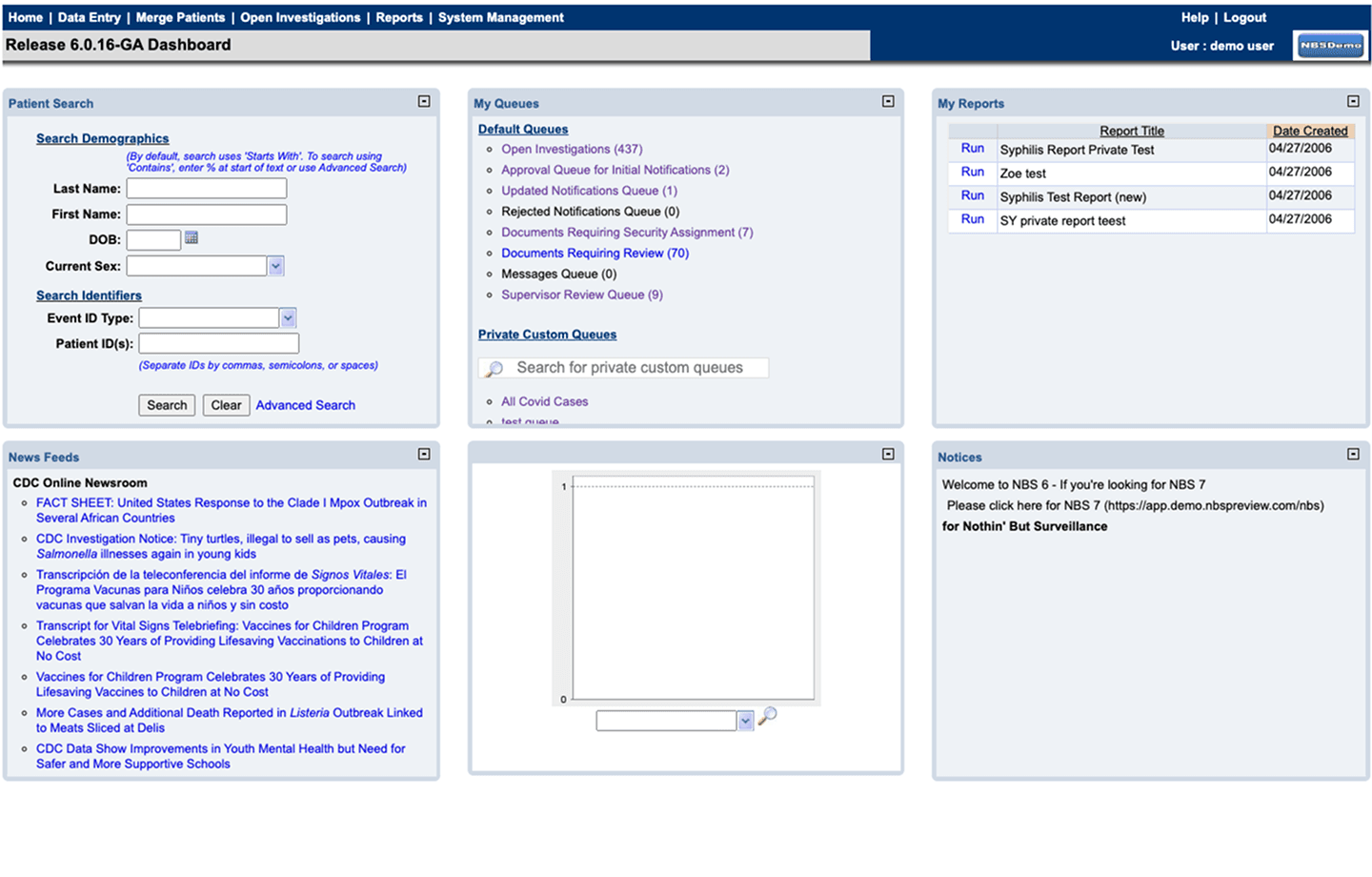
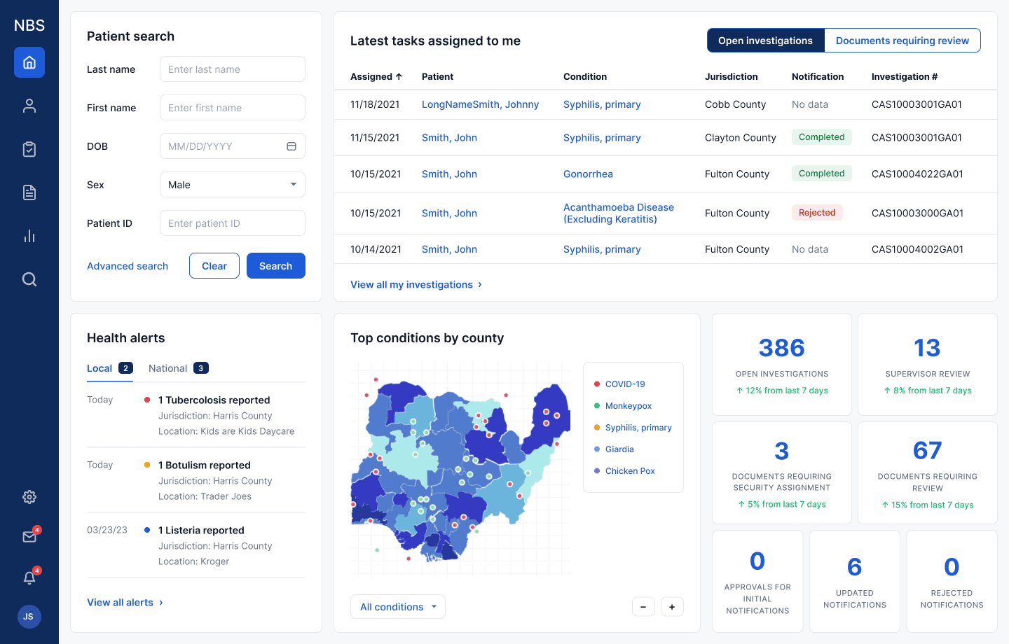
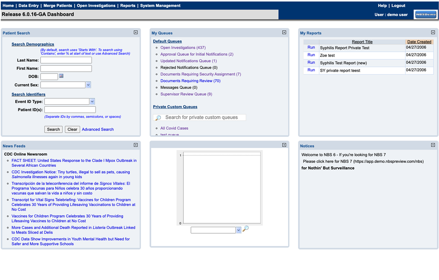
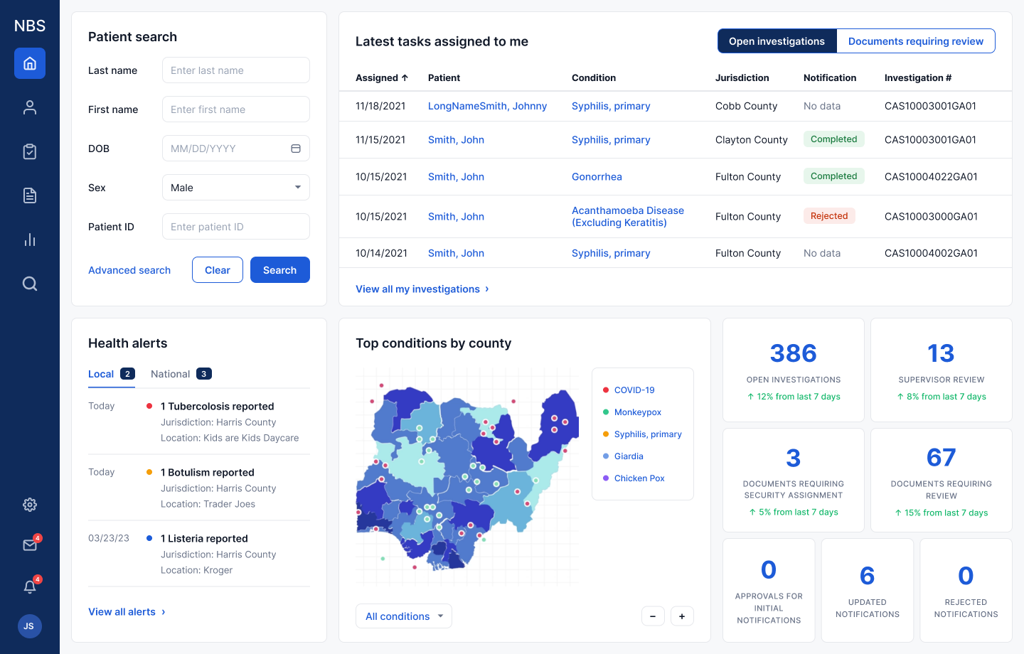
At the start of their day, epidemiologists (the primary users) open the queues. The “Documents requiring review” (DRR) queue holds the lab, case, and morbidity reports that arrived overnight and could not be auto-triaged. Each record needs a human call: open an investigation, or mark it reviewed. The “Open investigations” queue holds the active cases, worked to completion and reported out to the state and CDC on a clock. With these two queues came two questions: what came in, and what needs working.
The problem
Two main pain points rose to the top in our conversations with users. The first was the amount of time they spent in the queues. The queues, especially the DRR, were overloaded with records, and each record required clicking in just to get the detail needed to make a determination. With so many arriving overnight and multiple clicks per record, users spent large parts of their day going back and forth between the queues and their records.
The second was the volume itself. If a lab, case, or morbidity report could not be auto-triaged, it landed in the DRR for manual review. Reports come from many different labs, the data quality is inconsistent, and the legacy rules engine was rigid, so large numbers of records fell through to human review. The architecture compounded it. For performance reasons, a queue displayed only 100 records at a time, so unless a queue held fewer than that, users had no way of knowing how many records needed processing, or of seeing all the work waiting to be triaged. Finding the records relevant to them meant filtering the data columns one by one.
And the state didn’t hold. The legacy architecture broke the browser’s back button, so clicking into a record and coming back wiped the filters, the page, the place in the list. Going back meant starting over. The cost came to three to four clicks per record, against thousands of records arriving a day. Add the two pain points together and the workflow was broken. Users spent more time identifying investigations than actually performing them.
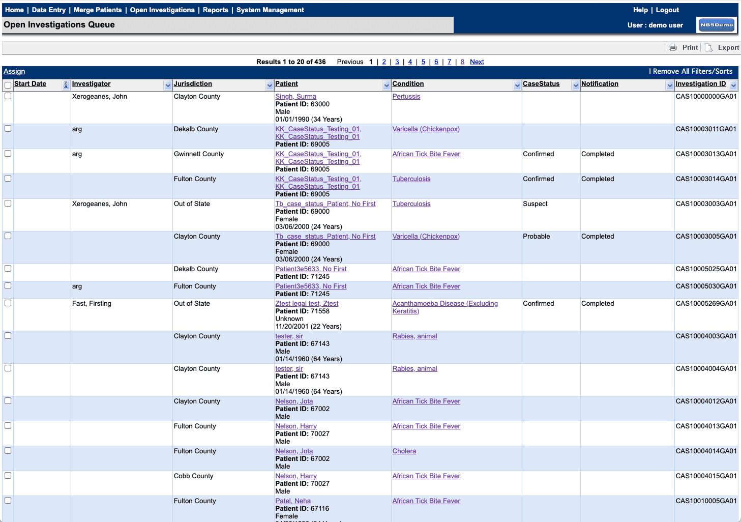
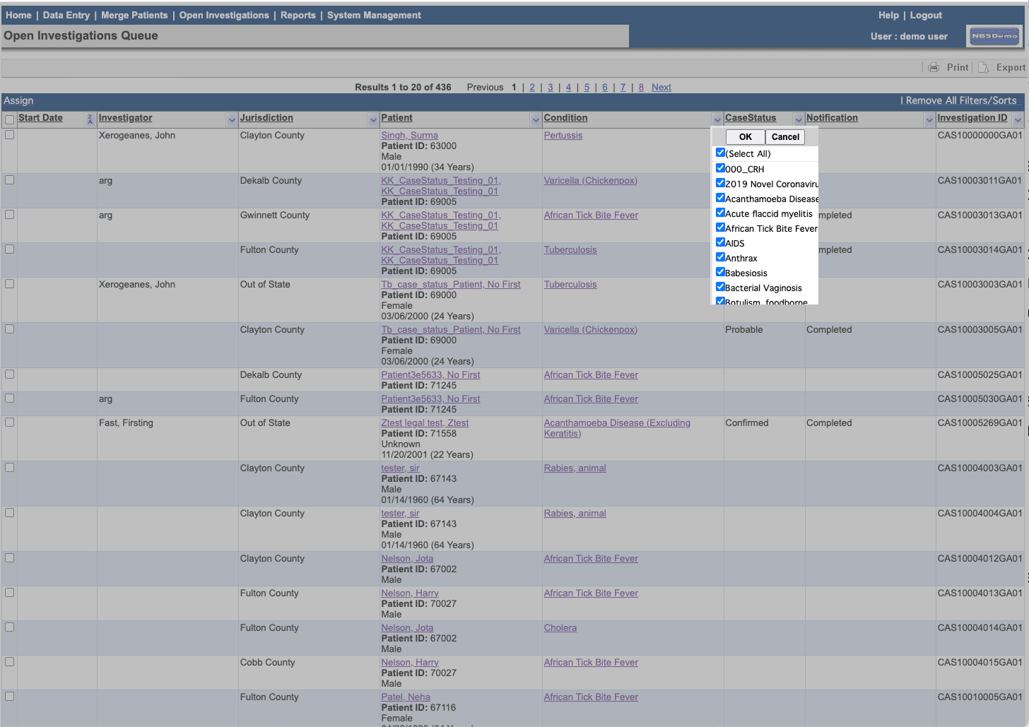
↑ back: state destroyed · filters gone · start over
3–4 clicks per record · measured through user tests and legacy mapping
↑ back: state kept · filters, columns, place
1 click · state preserved on return
Research and findings
We started by measuring the legacy baseline two ways. We mapped every legacy page, feature by feature, from the system side, then watched real users run the same flows to see where their paths diverged from what the code told us. The three-to-four-clicks measurement came from that work.
We tested first with two epidemiologists in-house, then with a working group the CDC assembled: twelve testers and subject-matter experts from health departments across the country, spanning epidemiologists, system admins, and data specialists. Behind them sat the NBS community itself, leads from 26 states on the CDC’s monthly calls, roughly eighty people. Our baseline survey to that group drew an 80% response and set the numbers everything after would be measured against: how long the triage workflow took, and how people felt about it.
Every interview and session was tagged with the participant’s role, jurisdiction, and program area, and the synthesis kept surfacing the same pattern: workflows varied along four axes. Jurisdiction, experience, disease, role. The reason was the data itself. What an epidemiologist needed to see to make a determination changed along those axes: Virginia epis needed different information than Tennessee epis, because their investigation criteria differed, or their reporting criteria did. No single default fit that spread.
Observation also fed work beyond our own feature. Watching how epis looked for information surfaced patterns we relayed to the data team, who owned the rules engine that automatically reviewed incoming reports during ingestion: common misspellings and variations of lab test names and results, or missing test names and other data points needed to map a report to a known condition, which was a requirement to start an investigation. Fixing those matches upstream meant fewer records that needed no human review ever reached a queue.
My own assumption went down with the defaults. I went in believing cleaner interaction patterns would carry most of the improvement: fix the clicks, keep the state, done. Testing said otherwise. Even on modern screens, epis kept drilling into records because the data on the surface wasn’t their data. Configurability stopped being a feature request and became the design mindset.
The case for configurable queues
The initial research findings led us to the need for configurable queues. The feature still had to be argued for. Legacy NBS offered a feature labeled “private custom queues,” which was just basic saved searches, but to the CDC’s program leads the name meant the need was met. When we put configurable queues on our roadmap recommendation at PI planning, the answer came back: custom queues already exist. The item was cut for that increment.
However, our discussions with users had told us the opposite: they read “custom” as customizable, tried to create them, and learned they weren’t really customizable, just the same basic search with a custom name and saved search parameters. That didn’t meet their need, so they worked around it.
During that increment, we built the counter-case with the CDC’s design lead, putting side-by-side designs of a simple queue at parity with the legacy feature against the configurable approach, with the level of effort attached so the roadmap cost was explicit. The community’s feedback was overwhelmingly positive. The configurable version was what they had always understood “custom queue” to mean, and they pushed for it to be developed sooner, ahead of an upcoming patient data-entry workflow already promised for the next increment. Their words, not ours, moved the program leads. The configurable queue system was approved: out-of-the-box queues, plus queues an epidemiologist can build, save, and share within a program area.
The rebuilt queue
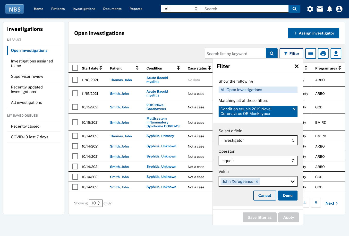
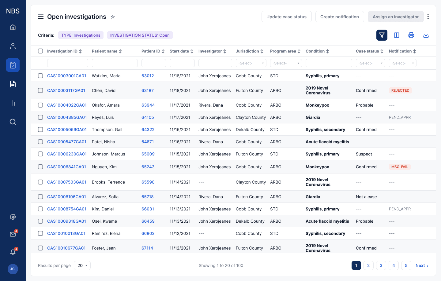
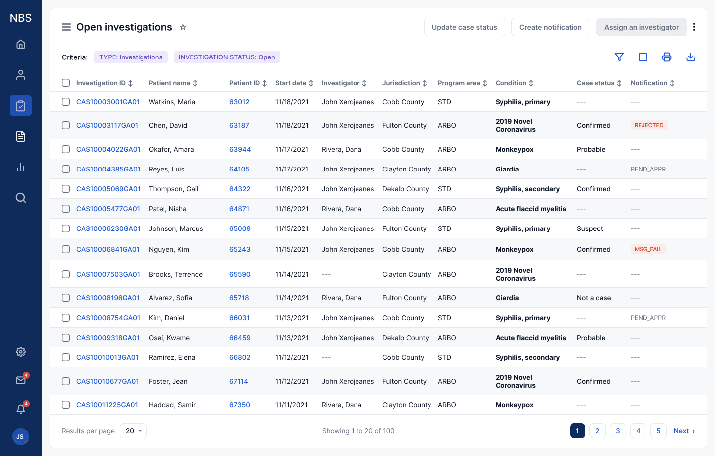
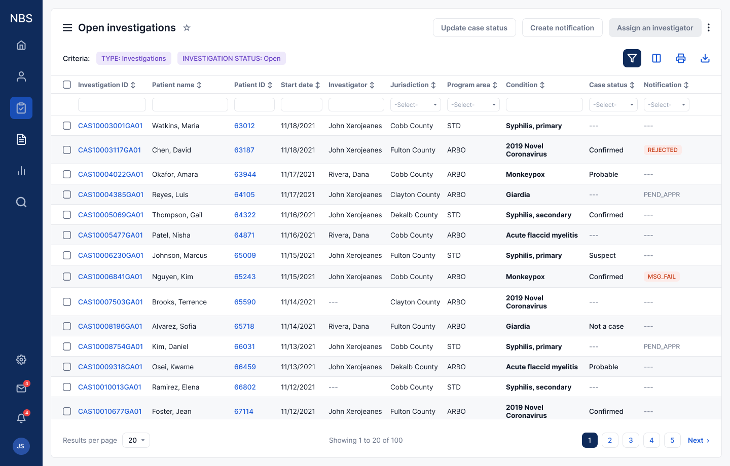
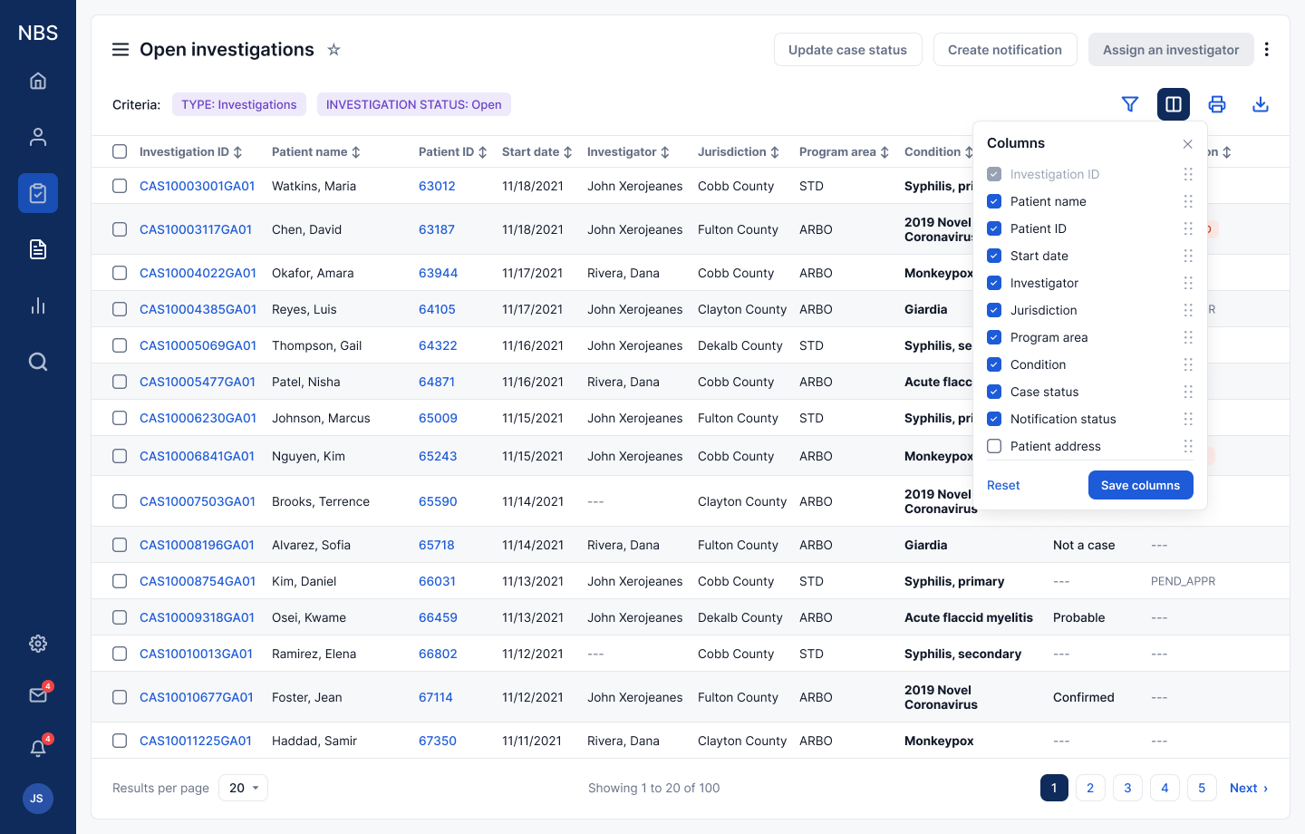
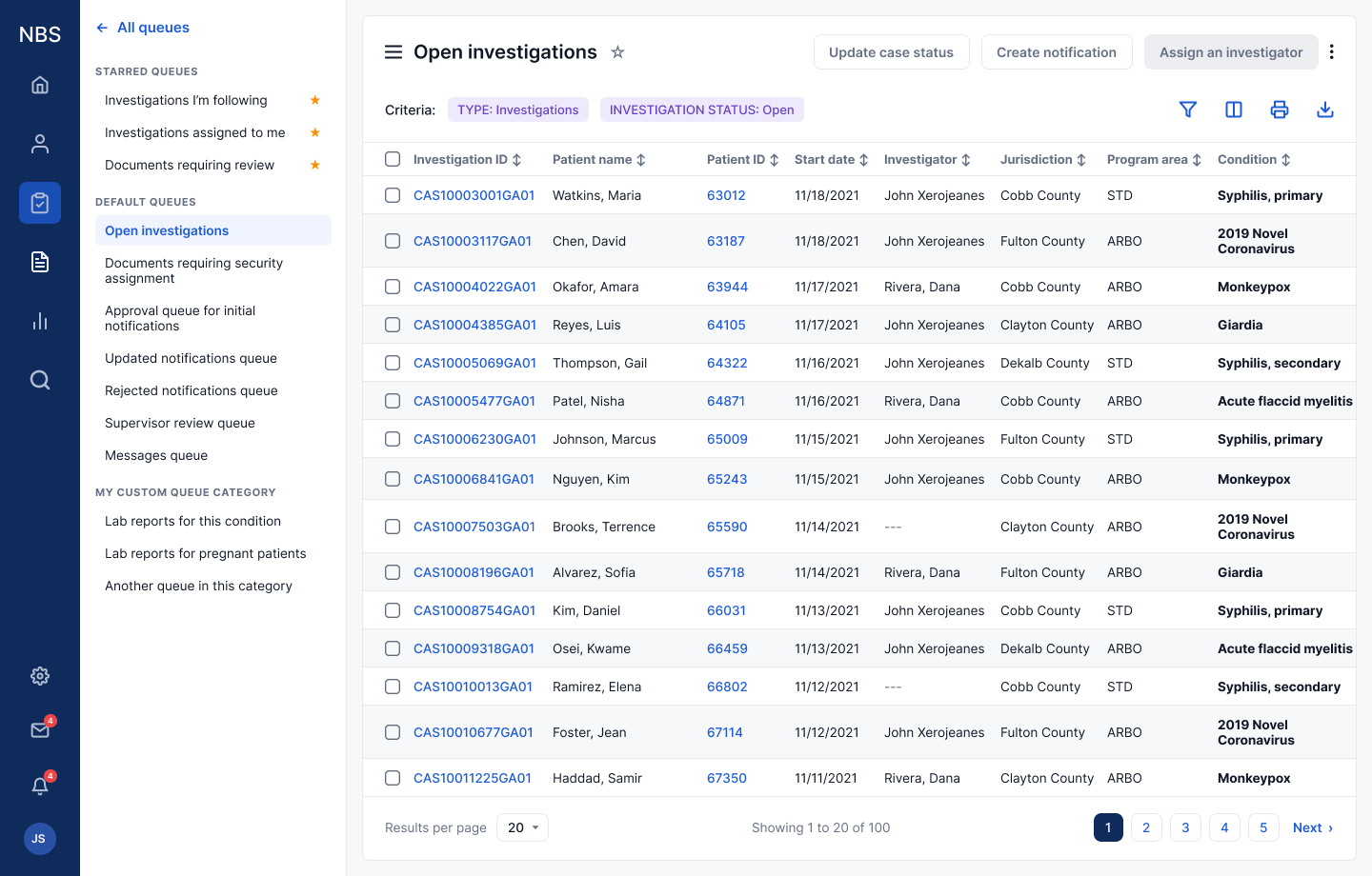
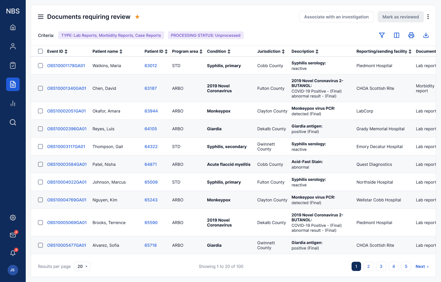
The rebuilt queue system is configurable in two ways. The first is the out-of-the-box queues themselves. Columns are configurable per queue, showing every available field or only what a program needs. Filters now open above every column at once and persist until reset. Result density is a preference too, anywhere from 10 rows per screen to 100. Smaller usability features round it out: bulk actions surface when rows are selected, and a menu reveals a panel listing every queue, default and custom, with starring to float the most-used to the top, so users stop navigating back to the home page just to reach another queue. Everything a user sets, the queue remembers.
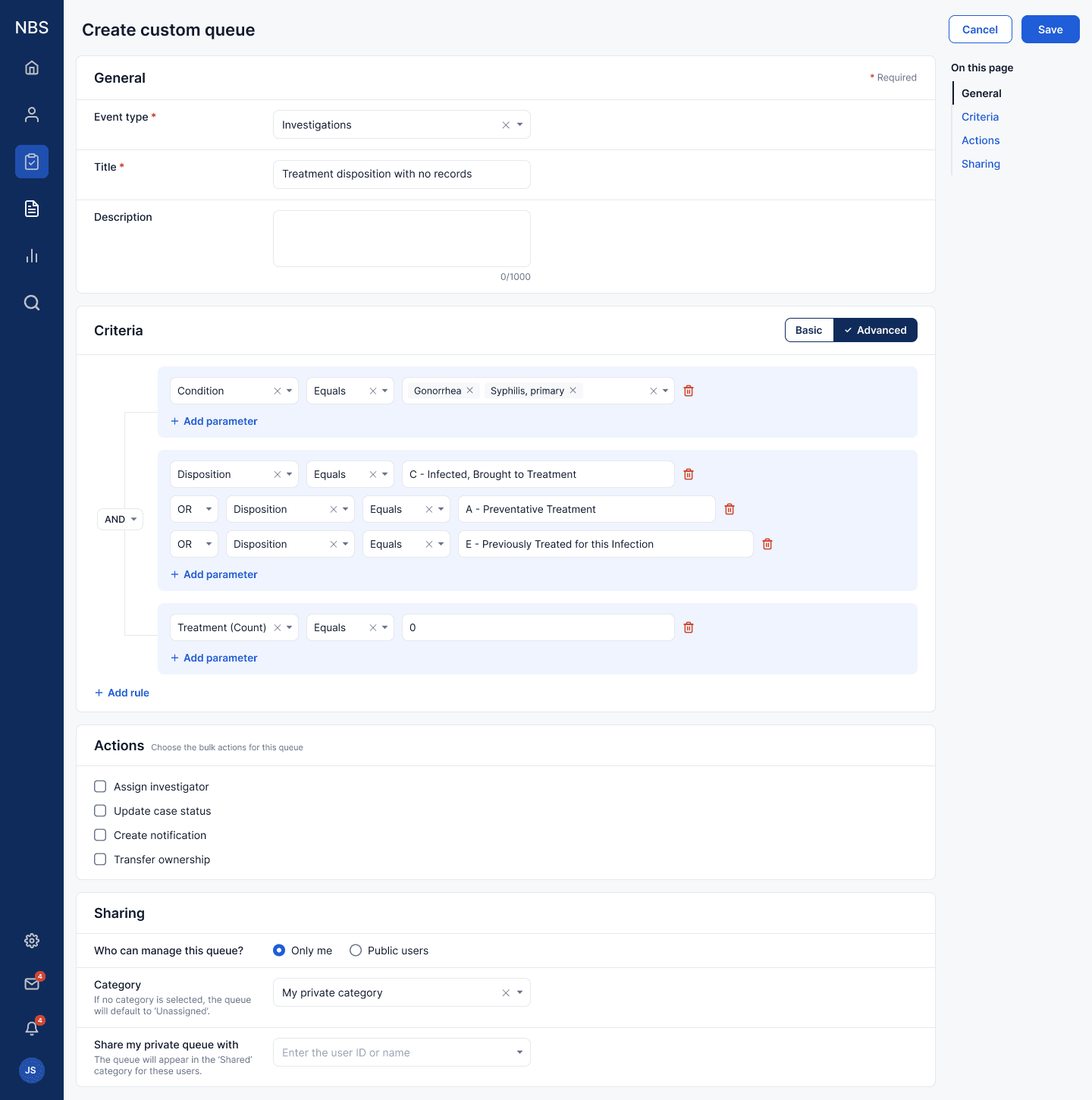
The second is the experience around creating custom queues. Instead of just saving search parameters, users can now create queues with custom queries, pick the actions relevant to the queue type, and share their queues with others in their orbit, based on permissions. That made room for more advanced queues that fit real workflows, and sharing meant queues could be managed at the state level, the local level, or individually: a state could create queues for its own reporting needs and share them with every health department in its jurisdiction.
Usability findings
Usability testing drove better iterations in a few places. The clearest was the column filters, before they became a filter row. Our first version managed every column’s filters from a single panel. It read like a query builder, so junior testers stumbled, and senior stakeholders wanted filters they could see across the table instead of hidden behind a panel. We went back to a filter per column, but this time exposed in a row above the columns, all of them visible at a glance. The panel concept didn’t go to waste. It inspired eye-opening discussions about what a custom query could be for a queue, and it led to the query builder inside the create queue feature, where there was room for it and the right audience, instead of complicating the process for someone just triaging.
Density was the other correction the tests handed us. Early tables and forms used generous white space to make the data scannable, and the pushback was stern. Our users are people who live in dense spreadsheets, and they wanted the data, not the air. We made compact the default and let the browser’s zoom provide the air on demand.
The design system
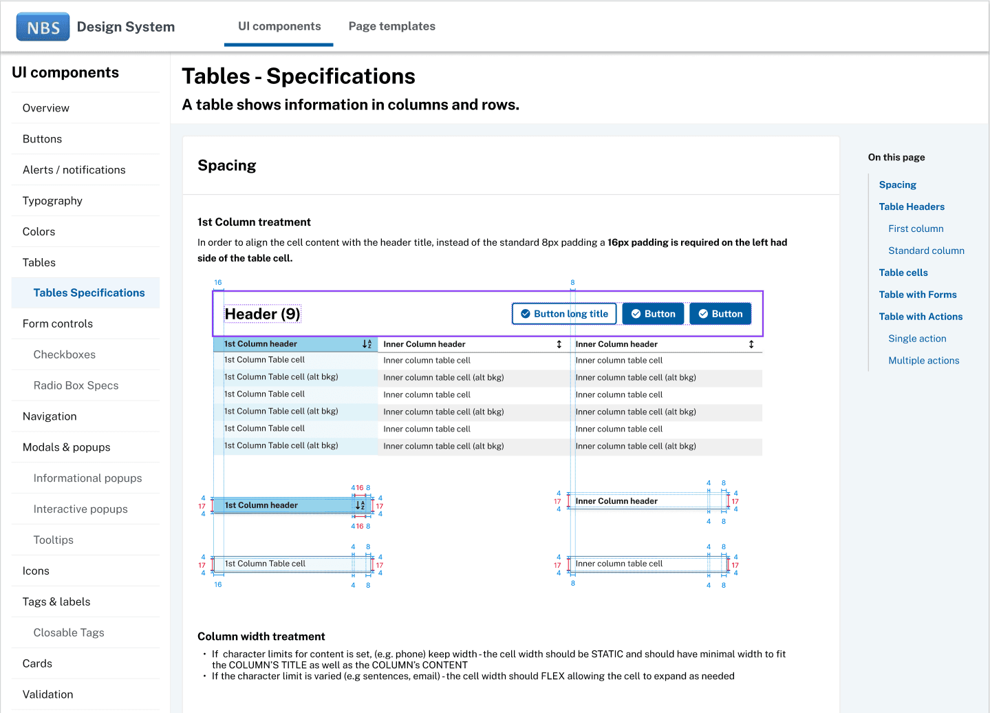
The queues forced the design-system question for the whole program. Teams had been using USWDS out of the box, each in their own way, and screens drifted apart. The earlier design iterations shown in this case make the point, with screens differing in patterns, structure, and even navigation depending on the team and the era. With the engineering lead I documented how NBS uses USWDS: which patterns, when, and what happens when a component has to bend. We ran it like a product: office hours where any designer on the program could bring screens for review, and a contribution process so a justified divergence rolled back into the system instead of forking it.
Accessibility and 508
Our approach to accessibility wasn’t just a checkbox at the end. Because this was government-owned software, Section 508 compliance was mandatory, and the CDC has a dedicated accessibility team that tests and signs off on everything it ships. Our job was to make sure our UIs were validated before submission, so we tested with axe DevTools alongside engineering every sprint.
One example of the impact came in the autocomplete component. The dropdowns in the legacy software auto-loaded a typed selection. They were fast, beloved by the community, but completely inaccessible. Implementing the standard USWDS combo box made it accessible but cost the user extra keystrokes, which drew immediate pushback from the testers. Our first attempt at customizing the component confused screen readers by causing a conflict between the typed value and the selection. So the first release shipped without the beloved behavior, which bought us time to follow up with a corrected implementation: the selection held back until the interaction completed, removing the screen-reader conflict while letting the component work the way users wanted. And since every USWDS component ships with its own accessibility tests, we re-ran every one of them against the custom component before submitting to the CDC’s accessibility team.
Key takeaways
As users of software, we take for granted all the little things software does to help us along the way. Saved preferences, configurability, session management, even something as small as the back button keeping history. Without those things, interaction workflows suffer, and the cost comes out of our time as we manage them ourselves. Compound that in a system holding hundreds or thousands of records, and it turns from a small nuisance into a major problem.
Our first pilot jurisdiction, Montana, felt that difference and relayed it on our first UAT call: records were finally easy to find, and they thanked us for the back button. One of their epis put it even better: “I’m all in. I’ve already created like 7 different custom queues for my work. I can’t wait till we get these config options for the investigation pages too.”
The lesson I’d hand another designer walking into a system like this: the interface is rarely the whole problem. I went in expecting interaction cleanup to carry the project, and what carried it instead was understanding how the work itself varied, by jurisdiction, by disease, by role, and letting that variance drive configurability, upstream data rules, even what a table’s default density should be. The queues got better when the data got closer to the person reading it.
The hardest lesson was about a different kind of memory. Client-side leadership kept turning over with administrations and funding, and every change reshuffled priorities and reopened settled questions. We had no decision log early on, so decisions lost their owners and their why. I don’t run long programs without one anymore: what was decided, when, by whom, and the rationale, kept where turnover can’t erase it. It’s also why this site annotates its own decisions in the margins.
Next steps
The next feature on our roadmap after queues was investigation workflows. Once an investigation opens, jurisdictions differ by program area and disease in how it must be worked and reported, and we were documenting those rules with the community toward a rules engine that could move investigations along automatically and cut redundant data entry. And with configurability as a new design mindset, we were identifying ways to carry those patterns forward.